


A UX Case Study on Enhancing Membership and Ticket Purchases on the New York Transit Museum Website
Improving Access to Transit History

Project Overview
Client
New York Transit Museum (NYTM)
Timeline
January 2023 - April 2023
4 Months
Team
Karan Vora +2
Key Tasks
User Research, Wireframes, Usability Testing
Introduction
What is NYTM?
The New York Transit Museum is a popular cultural destination located in Brooklyn Heights, New York that attracts visitors from all over the world to explore the city's transportation system's history. The museum is housed in a decommissioned subway station, and contains historic metro, train, and bus artifacts–including obsolete subway cars visitors can board and explore.
The website of the New York Transit Museum conveys essential information about the museum, its collections, and public programs, serving as a valuable resource for researchers interested in public transportation history. Given the museum's emphasis on pre-purchasing timed tickets, the website plays a crucial role as a primary touchpoint for museum visitors.
Why redesign?
Information Overload
The website has experienced significant content expansion over the past 5-6 years without a clear organizational strategy, resulting in information overload for users.
Poor Content Organization
The heavy content on the site is not well-organized, leading to difficulties for users in finding relevant information.
Inconsistent Visual Language
The visual language across the website is inconsistent, lacking a cohesive design that hampers the overall user experience.
What are we aiming for?
// Redesign the ticket purchasing process to be more seamless.
// Simplify the membership buying process, making it easy to understand and keeping users constantly informed to eliminate the need for back-and-forth during the membership purchase.
// Organize the content and streamline the navigation to require minimal cognitive effort, aligning with the user's mental model.
What are museum website users seeking?
Empathize
To kick off our research, our aim was to grasp users' mindset when using a museum website for purchasing a membership. Additionally, we sought to comprehend their expectations regarding content and navigation on the website.
User Interviews

Once we solidified our research goals, we opted for user interviews as our primary data collection methodology.
We conducted interviews with 6 participants to glean insights into their communication and access patterns when interacting with museum and membership websites, with a particular focus on content and organizational aspects.
Affinity Diagram

After user interviews, we utilized an affinity diagram to organize and analyze our findings.
4 out of 6 users mentioned using their phones to access museum websites, especially when purchasing tickets for exhibits.
Many users expressed occasional difficulties, attributing it to the overwhelming amount of unstructured information provided.

Persona
Based on the findings organized in the affinity diagram, we crafted a persona named Sarah, which humanizes the design process by giving a face and personality to users. This helped us empathize with the end-users, fostering a user-centered mindset. In the persona above, Sarah articulates her pain points and goals.
we leveraged this persona for continuous validation and guidance in shaping the website's design decisions.
How do users envision the organization of content?
Define
Given the abundance of information on the website, it is crucial to ensure user-friendly access and comprehension. To achieve this, we conducted an evaluation of the existing Information Architecture for seamless and straightforward navigation.
Issues with existing Information Architecture

Unclear connection between primary and secondary menus
Poor Navigation

Unclear hierarchy impedes user navigation despite abundant information
Inadequate Content Hierarchy

Structural inconsistencies across the website's pages
Poor Information Organization

Use of unfamiliar jargon and unclear terminology for users
Inconsistent Terminology
Card sorting

We conducted a card-sorting activity with participants using the OptimalWorkshop (OW) platform.
Participants were given a list of existing navigation items without context, and they grouped them based on their understanding of which items belonged together. OW generated a similarity matrix, indicating the percentage of participants who grouped specific items.
Participants structured items based on their functionality or purpose, emphasizing practical aspects over content. Additionally, they preferred straightforward labels, choosing familiar terms and steering clear of complex or ambiguous language.
Tree Testing

We additionally performed tree-testing research to assess the hierarchy and discoverability of topics on the current website.
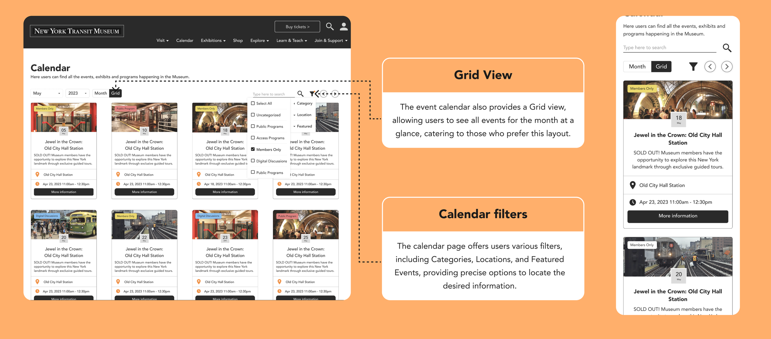
Based on the success observed in our tree testing, we reimagined tertiary-level content with a high grouping preference in content navigation formats. This allowed us to incorporate more visual and textual information for each option, reducing confusion and providing additional information for users who might not be familiar with the content.
Proposed
Information Architecture

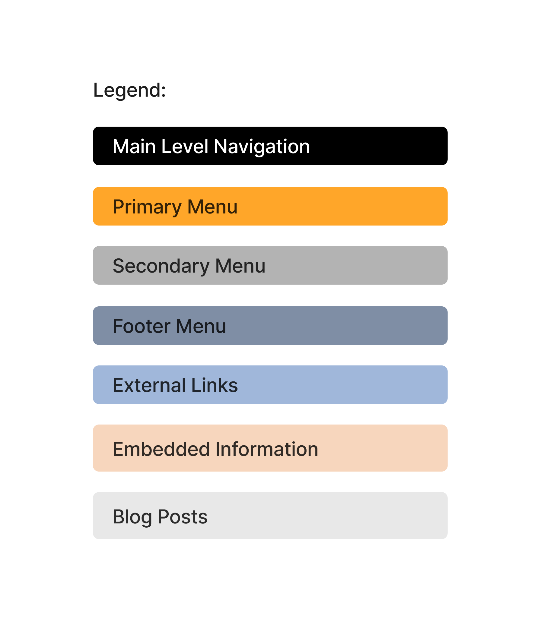

In our proposed Information Architecture, we prioritized simplicity with a clear and understandable content hierarchy. We included tertiary-level information embedded into pages for added insight and suggested two blog spaces, "News" and "Historical Insights," to accommodate new information and insights for the New York Transit Museum.
How do other museums structure their information?
Ideate
To ensure an optimal user experience, we thoroughly examined nine competitors, encompassing both direct and indirect competitors. Immersing ourselves in the perspective of our persona, we concentrated on criteria crucial for an unforgettable museum visit and membership program.

Competitive Analysis

Design Process
We've concentrated on two primary tasks that are most frequently performed on the website:
Becoming a Member
Purchase a ticket for an event
Ideate
What is more crucial for users?
In the process of pinpointing the core objectives for each task, we strategically crafted user stories and task flows. This deliberate approach not only aided us in understanding the essential focus points but also played a crucial role in minimizing the overall number of screens required for a more streamlined and efficient user experience.
User Stories and Task Flows
Task 1: Membership Purchase
User Stories


Important Tasks:
Find out the benefits of being a member
Compare different levels of membership and decide which is the best
Fill out the membership information
Pay for membership
Task Flow

Task 2: Event ticket purchase
User Story

Important Tasks:
Find out what events are coming up
Read more about the details about the event
Register for the event (Add Tickets & Visitor Info)
Pay for the event
Save the ticket and event details in my calendar
Task Flow

Prototype & Testing
What defines an ideal visual language for the website?
Sketches


Initial ideas were streamlined and transferred to sketches to identify the design decisions to ease out the user experience.
Mid-fidelity wireframes

The most-usable and functional sketches were analyzed and were converted into Mid-fidelity prototypes on figma.
Usability Testing

we conducted a Rainbow sheet analysis on our mid-fidelity prototype to iterate and analyze the usability of the model. The data derived from this testing was used to inform design decisions and iterate further before proceeding to the high-fidelity prototype
Visual Guide

We implemented a cohesive style guide for our high-fidelity prototypes, ensuring consistency across both web and mobile interfaces.
Hi Fidelity Screens
Task 1: Membership purchase

Home > Choose a membership > Add personal information > Payment > Confirmation

Home > Choose a membership > Add personal information > Payment > Confirmation

Home > Choose a membership > Add personal information > Payment > Confirmation
Home > Choose a membership > Add personal information > Payment > Confirmation


Home > Choose a membership > Add personal information > Payment > Confirmation
Task 2: Event ticket purchase
Home > Calendar > Event information > Event Registration > Add personal information > Payment > Confirmation

Home > Calendar > Event information > Event Registration > Add personal information > Payment > Confirmation

Home > Calendar > Event information > Event Registration > Add personal information > Payment > Confirmation

Home > Calendar > Event information > Event Registration > Add personal information > Payment > Confirmation

Key Objectives
Navigating the intricacies of managing heavy content proved to be a valuable lesson. The project emphasized the importance of effective content organization, ensuring that users could easily digest information without feeling overwhelmed. This experience underscored the significance of creating intuitive structures for heavy content and optimizing user engagement and understanding.
Exploring user perspectives during the empathizing phase was fascinating. It provided diverse contexts, essential for crafting a universally appealing product that resonates with a broad audience.