


Project Overview
Client
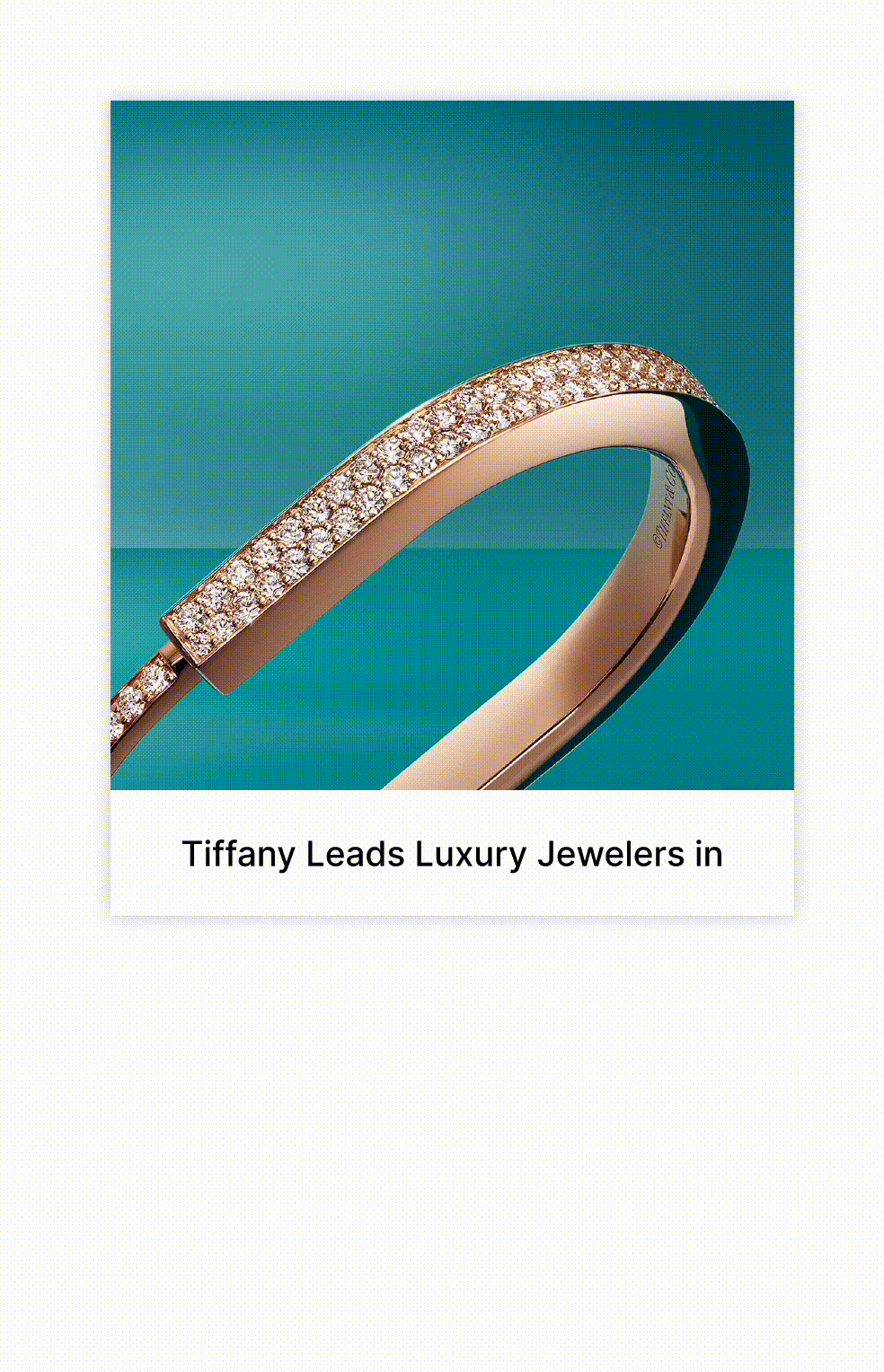
Tiffany & Co.
(Unofficial)
Timeline
March 2024 - April 2024
6 Weeks
Team
Karan Vora, Michelle Huang,
Laiba Sarwar & Cici L
Key Tasks
Deconstruct website, Identify inconsistencies, Develop design system, Document design system
Meet the Team Behind the System
The Blue Box Team
The Blue Box Design System Team comprises highly skilled UX designers and researchers. Each team member has invested significant time in understanding the current website's layout. Their dedication has resulted in this beautiful UI Kit, which we call the design system. This system is designed to elevate Tiffany & Co.'s design and development experience, taking it to a whole new level.

My Role in Building the System
As a UX Designer, I played a key role in building the Blue Box Design System. My focus was on establishing a strong foundation and ensuring a smooth workflow for the entire team.


Laying the Groundwork
Following the initial audit of Tiffany & Co.'s digital presence, I played a crucial role in identifying inconsistencies in design elements. This analysis allowed us to develop core design standards, including colors, typography, and iconography.
Crafting Reusable Building Blocks
In addition to core assets like colors and icons, I actively participated in designing and documenting essential UI components such as blocks, cards, carousels, collapsible sections, dropdowns, and more. These components serve as the building blocks for consistent and elegant user experiences across all digital touchpoints.
Facilitating Collaboration
Recognizing the importance of clear communication, I actively collaborated with team members during the documentation stage. This ensured consistent language and style within the documentation, fostering efficient adoption by designers and developers.
Ensuring Quality & Accessibility
Throughout the design system creation process, I maintained a quality assurance role. This included ensuring consistency in component design and adherence to accessibility best practices.
By focusing on these core areas, I aimed to contribute to a robust and user-friendly design system that empowers Tiffany & Co. to create exceptional digital experiences.
Tiffany & Co., renowned for its timeless jewelry and unparalleled quality, aims to transcend its reputation as the world's foremost jeweler. Their mission goes beyond the iconic blue box, embracing a forward-looking perspective to influence the future of luxury. This includes a strong commitment to ethical sourcing, sustainability, and social responsibility, all rooted in their core values of "Doing the Right Thing" and "Thinking Boldly."
While their digital presence is visually appealing, there is room for enhancement. Despite the existence of a style guide, inconsistencies have emerged in crucial design elements, along with accessibility concerns, which will be discussed further in our process.
The Client
Tiffany & Co.
The Need
Why Does Tiffany & Co. Need a Design System?
A design system can bridge this gap, ensuring a seamless and unified brand experience while streamlining design and development processes.
Enhanced Brand Consistency: A design system establishes a single source of truth for all design elements, guaranteeing a cohesive brand experience across websites, mobile apps, and all digital touchpoints. This reinforces brand recognition and strengthens Tiffany & Co.'s image of timeless elegance.
Improved Design & Development Efficiency: Pre-built, reusable components and clear design guidelines streamline the design and development workflow. Imagine designers and developers assembling beautiful and functional digital experiences with building blocks, saving valuable time and resources.
Modular Design for Flexibility: The design system promotes a modular approach. Components can be easily combined and customized to create unique experiences for different platforms and campaigns. This fosters faster iteration and a more adaptable digital presence for Tiffany & Co.
The Process
How did we make a well structured design system?


Step 1: Audit and Analyze the current system
Our journey began with a comprehensive website audit. We meticulously reviewed each page, analyzing design elements and identifying stylistic variations across the website. We documented these variations for similar elements, taking the extra step of inspecting the code to assess reusability and design efficiency. This in-depth analysis, while time-consuming, ensured our insights were well-founded and actionable.
By deconstructing Tiffany & Co.'s existing design system (or, potentially, style guide), we uncovered some significant issues. Let's delve into these challenges:
Inconsisent
While Tiffany & Co.'s website boasts a consistent color palette and general styling, a closer look reveals inconsistencies. Our UI audit identified instances where older styles linger on previously created elements, clashing with newer design updates on other pages.
This creates a disjointed user experience that undermines brand recognition. Imagine encountering a mix of design styles while browsing Tiffany & Co.'s exquisite jewelry collections – it wouldn't quite capture the sense of timeless elegance they strive for. Additionally, multiple versions of the same element can lead to confusion for users and make it difficult to maintain a cohesive brand image.
Inaccessible
Accessibility is paramount for any digital experience, and Tiffany & Co.'s website presents some room for improvement. While a color palette exists, its application across different elements doesn't always meet accessibility standards as outlined by WCAG guidelines. This could involve issues with color contrast, icon size, or compatibility with screen readers. Screen readers rely on proper tab order and aria-labels to convey information to users with visual impairments. Inconsistencies in these areas can create significant barriers, potentially excluding users with disabilities from fully appreciating Tiffany & Co.'s digital offerings.
Inefficient


Beyond accessibility concerns, the lack of a unified design system impacts development efficiency. Teams often recreate similar components and features for each page.
This lack of reusability translates to wasted time and potentially lengthens the development process. Imagine designers and developers constantly reinventing the wheel instead of building upon a common foundation.

Step 2: Defining Brand Values
To start our design system we needed to set some principles/values that align with Tiffany’s vision and mission. After understanding the identity of brand and its style we defined 3 brand values. Building a design system requires a lot of process of introducting components and re visitng them to make changes along with collobartively working with a team and defining such values helped us guide our decisions throughout development.

Unique Branding

Inclusive Experiencies

Consistency
Step 3: Creating a System
We used atomic design to build consistent, modular, and scalable components. Brad Frost's atomic design is a methodology that breaks down an interface into small, reusable components called atoms, which can be combined to create larger, more complex components and pages. This approach allows us to create designs that can be easily updated and maintained over time.

Atoms


Molecules

Organisms

Templates

Pages


We began by establishing a core set of foundational styles for our atomic components. This design language serves as the building block, ensuring visual cohesion and effortless assembly of more complex molecules and organisms within the design system.
Colors - Building on Brand Recognition
Leveraging Tiffany & Co.'s signature turquoise, the palette ensures brand consistency and user accessibility (WCAG 2.1). A limited selection maintains a unified aesthetic.
Typography - A Voice for Elegance
Defined typefaces, weights, sizes, and styles create consistent brand voice and visual hierarchy across web pages. Abhaya Libre (serif) adds sophistication, while Inter (sans-serif) prioritizes readability.
Iconography - Timeless Communication
Inspired by Tiffany's elegance, clear and consistent icons were meticulously crafted. Each icon is essential for optimal readability across all screen sizes, enhancing the user experience.


Following the establishment of foundational atoms, we assembled more complex molecules (groups of atoms) and organisms (combinations of molecules). This approach resulted in a versatile library of customizable UI components.

Customization at Your Fingertips
Recognizing the need for flexibility, we prioritized component customizability. This allows for similar components to be easily adapted for various use cases through toggle options and selections.

This emphasis on customization, while extending the development timeline, empowers designers and developers to create a wider range of experiences without sacrificing efficiency.
Card Component customization

The Blue Box Design System prioritizes accessibility, ensuring that your designs are accessible to all users. We incorporate the latest research and adhere to the best practices outlined in the Web Content Accessibility Guidelines (WCAG) to create inclusive experiences. In our documentation, we have provided various accessibility guidelines tailored to the complexity of each component, facilitating a smoother design and development process.
Color Contrast
For optimal readability, the Blue Box Design System prioritizes sufficient contrast between text and background elements. We recommend a minimum contrast ratio of 4.5:1, adhering to WCAG AA standards. This ensures clear visual distinction for a positive user experience.
In most components, we use the following two ratios for text and background:

Tab order guidelines
For components with multiple interactive elements, clear tab order is crucial. The Blue Box Design System defines a logical tab order that aligns with natural user behavior, ensuring a smooth and intuitive navigation experience for users with keyboards or screen readers. This not only benefits users with disabilities by allowing them to easily access and interact with all functionalities but also streamlines development by providing a consistent foundation for building interactive components.

The Magic Happens
This is how
Step 4: Writing Documentation
The Blue Box Design System is more than just code and components. Just as we meticulously built the system itself, we prioritized comprehensive documentation for optimal user experience. This central hub functions as the definitive guide, housing all design principles, accessibility standards, components, and best practices in one easily accessible location. This ensures everyone working within the system has a "single source of truth" for reference and collaboration.


Driven by the transformative power of design systems, the Blue Box Figma UI Kit extends beyond Tiffany & Co.'s internal design team. This comprehensive toolkit provides pre-built, customizable components that seamlessly integrate with the Blue Box Design System.
To empower a broader design community, we've made it readily available through the Figma Community. This fosters wider adoption and ensures the Blue Box Design System can benefit a wider range of projects.

Our Blue Box Design System documentation takes full advantage of Zeroheight, a collaborative platform that seamlessly integrates with Figma. This allows designers to effortlessly create and maintain web-based documentation, fostering clear communication and knowledge sharing.
To ensure the Blue Box Design System's long-term effectiveness, the documentation includes not only usage guidelines for each component but also comprehensive governance policies and support resources. We've established a dedicated email address (blueboxdesignsystem@gmail.com) for inquiries, along with a feature request form and a user-friendly online support form to facilitate ongoing communication and feedback. This multi-pronged approach ensures the system remains adaptable and meets the evolving needs of its users.

Future Enhancements
Keeping the Blue Box Shiny: What's Next?
The Blue Box Design System may be complete, but its journey of evolution continues:
Continuous Improvement
The system can expand with new components, advanced features like micro-interactions, and potential data integration with content management systems to keep pace with design trends and streamline workflows.
Maintaining Efficiency
The system's true value lies in its ongoing maintenance. Regular performance monitoring will identify areas for improvement and ensure the Blue Box Design System remains efficient, user-friendly, and a valuable asset for Tiffany & Co. for years to come.
Reflection
Six Weeks, a Skilled Team, and a Design System Journey: Lessons Learned
In just six weeks, our design team went on a transformative journey, becoming a dream squad that embarked on a design odyssey that would change everything. Our shared vision, fueled by late nights and endless brainstorming, led us to unearth a digital treasure: The Blue Box Design System. This project was not just about ticking a box; it was a deep dive into design efficiency, user focus, and the unseen groundwork that forms the foundation of the digital world.
From Consumers to Creators
Before this project, I mostly engaged with design systems as a user, completely ignorant of the rigorous planning and attention to detail necessary to create such strong tools. Creating the Blue Box Design System was an eye-opening experience. It established a deep appreciation for the unnoticed heroes: the designers who diligently construct solutions that streamline operations and improve user experiences. It's a sobering reminder of the hidden labor that fuels the digital environment we use daily.
Research, the Invisible Compass
There's an undeniable draw to getting into the creative aspect of design. However, this project served as a potent reminder that the most appealing design solutions often begin from a solid foundation. The Blue Box Design System wouldn't exist without the extensive research phase that kickstarted the project. Our comprehensive website audit and in-depth analysis of Tiffany & Co.'s brand identity helped shape a flexible and user-centric framework. This experience reinforced the value of research as an unseen compass that leads us to successful design ideas.
Accessibility: A Core Value in Action
Accessibility has always been a core principle for me. The experience of building an accessible examination system for visually impaired students during my undergraduate studies ignited a passion for inclusive design. The Blue Box Design System offered a chance to champion this value on a larger scale. By prioritizing accessibility from the outset, we ensured that everyone, regardless of ability, could navigate Tiffany & Co.'s digital world flawlessly. This project served as a powerful reminder that accessibility isn't just a technical consideration – it's the foundation for creating a welcoming and inclusive digital experience for a wider audience.